CSS3 Bookshelf
Posted on by Steve Workman About 4 min reading time
Using CSS3 and a little JavaScript, I've created a bookshelf for your blog. For a demo, go to the CSS3 bookshelf, for some more information on how it was made, read on.
Inception
A few weeks ago, Nic Price (@nicprice) and I were talking about blogs and taking a picture of his bookshelf to show what books he's found helpful over the years. After a little consideration, and watching the CSS 3D transform demo (snow stack), I thought that this is a perfect candidate for some CSS trickery.
The sketch
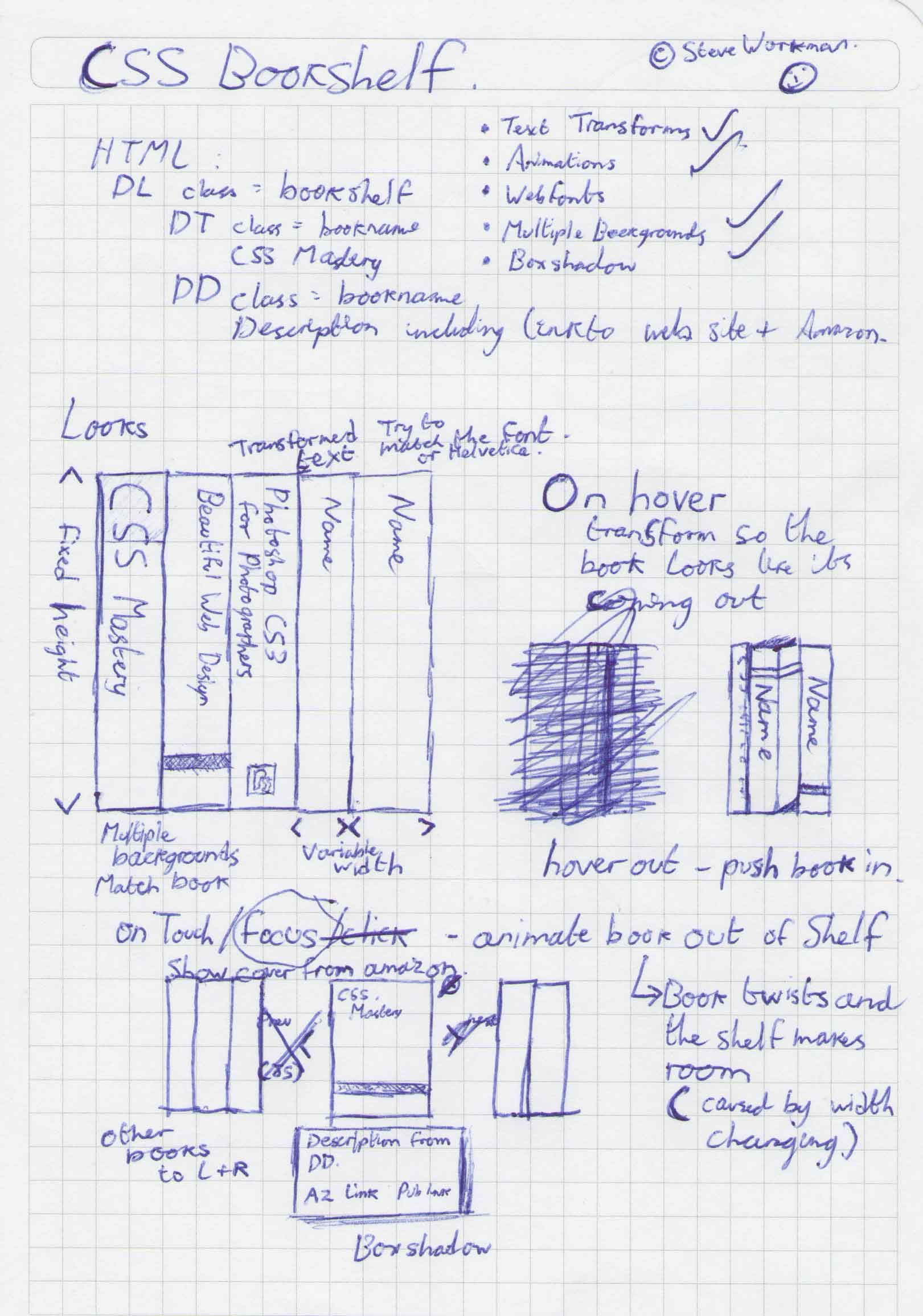
One sunny morning, I drew this:
The concept is simple:
- a definition list of title and description.
- Style and transform thes to look like books on a shelf
- CSS animations on hover to pull the book slightly out of the shelf
- Move the book into the centre on click/touch, displaying the definition underneath
- Use as many CSS3 techniques as possible
Implementation
Starting with the definition list, I set out the widths and heights required for each of the books. Initially, only the spine of the book was showing, but that didn't look as good as a small gap. Each element is positioned using relative-absolute positioning, allowing for simple movements using the left property to center each book in the screen, instead of lots of calculations when using translateX. So, pretty standard stuff to get the books in line.
Book Styles
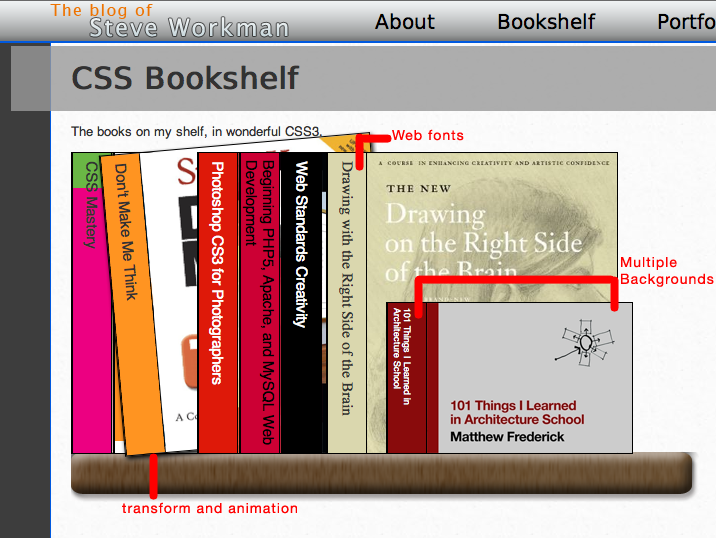
Each book has a css class associated with it. This allows for title position customisation and different backgrounds, widths and heights. Each book makes use of CSS3 Multiple backgrounds, allowing for different images between the book spine and the front cover. Whilst this can be done in one image with photoshop, I decided not to (potentially, the spine of the book can be removed).
Book titles
The title of each book needs to be rotated to read down the spine. Optionally, I could have put the titles into the background elements, making them more like the actual books. Unfortunately, I couldn't find good images of the spines on the internet, and there's more opportunity for CSS3 transforming text. So, using the -vendor-transform property, I rotated the text 90 degrees:
-webkit-transform: rotate(90deg); /\* Rotate book title 90 degrees \*/
However, this rotates the whole element, so a tag has to be used to target only the text. In the example there's a few other properties to make the text line up properly, and on some books it's overridden to allow for longer or shorter titles. In the end, it looks like this:
dl.bookshelf dt span {
	-webkit-transform: rotate(90deg); /\* Rotate book title 90 degrees \*/
	-moz-transform: rotate(90deg);
	-o-transform: rotate(90deg);
	-ms-transform: rotate(90deg);
	transform: rotate(90deg);

	display: block;
	position: relative;
	width: 300px; /\* width is height of book \*/
	top:150px;
	right: 130px;
}
Animations
On hover (or focus) the book pulls itself out from the shelf and tilts slightly, adding some box shadow to give it a 3D look. This is in two parts, defining what elements will transition on the element, and then changing the values on hover. These values were gained by trial and error, with a small rotation and translation looking better than a more pronounced movement.
dl.bookshelf dt {
	height:300px; /\* Default height of books \*/
	display: block;
	float: left;
	border:1px solid black;
	font-size: 1.5em;
	position: absolute; /\* Using relative-absolute positioning \*/

	-webkit-transition-property: left, webkit-transform, webkit-box-shadow; /\* transition on two properties \*/
	-webkit-transition-duration: 0.5s; /\* take 0.5 seconds \*/
	-webkit-transition-timing-function:ease-in; /\* Ease in \*/
	-webkit-transform-origin: left bottom; /\* use the left, bottom of the element as the origin of transformation \*/
/\*... see css file for full vendor property list \*/
}
/\* Hover over or focus on a book and have it pull out of the shelf \*/
dl.bookshelf dt:not(.showBook):hover, dl.bookshelf dt:not(.showBook):focus {
	cursor:pointer; /\* turn cursor to a hand \*/

	-webkit-transform: rotate(-5deg) translateX(-30px); /\* Roate 5 degrees and pull out 30px \*/
	-webkit-box-shadow:#000 1px 3px 5px; /\* Add a box shadow so it looks like the book has depth \*/
/\*... see css file for full vendor property list \*/
}
Note the dt:not(.showBook), because we don't want the selected book rotating when hovered over. I tried using -webkit-perspective here to make the books look a little more "3D", but I couldn't make it work properly. It's a feature only available on Safari on Snow Leopard so isn't widely used enough for my purposes.
All of those three together produces this:
Showing the Book Using a little JavaScript, I added a click event that added a class of "showBook" onto the
The animation is pretty simple stuff, modifying the left property and the z-index, no keyframed animation. I did try more complex animations, but it didn't add anything to the look and feel, only complicated code.
Themakes use of border radius, RGBA for its background and text-shadow to make the text stand out on the opaque background. Eachhas an Amazon affiliates link which floats to the right hand side of the definition. These together look like this:
The code for that looks like this:
dl.bookshelf dt.showBook {
	-webkit-transform: translateZ(10px); /\* Come above all the books \*/
	-webkit-box-shadow:#000 10px 10px 5px;
	/\* See code for other vendors \*/

	left:335px; /\*(page width / 2) - (book width / 2), or thereabouts \*/
	z-index: 100; /\* just in case the translateZ doesn't work \*/
	padding-left: -80px;
}

/\* Class applied to definitions when shown \*/
dl.bookshelf dd.showBook {
	display:block;
	width:350px;
	position: absolute;
	top:310px;
	left:250px;
	background:rgba(0,0,0,0.8); /\* RGBA background \*/
	padding: 10px;
	color:#fff;
	-webkit-border-radius:10px;
	-moz-border-radius:10px;
	border-radius:10px; /\* Opera and MS will support border radius without prefix \*/
	text-shadow: #666 1px 1px;
}
Before I finish, there are a few caveats:
- The only browsers to completely support all features are Safari for Mac, Chrome 5 and Opera 10.5
- Firefox gets animation support in 3.7 (or above)
- Animations aren't smooth in Opera 10.5 until they've been run a few times; after that, it look fantastic.
- Internet Explorer... let's not go there. Some features like border radius will work in IE9. I've put all vendor prefixes in even if the browser doesn't support it at this time.
Update #2: Firefox 5 is fully supported with animations. IE9 is functional and IE10 platform-preview 2 works very well
So, enjoy the CSS3 Bookshelf, I've enjoyed making it and it's a good use of this new technology. I'll make a downloadable package available in a few days, for now, take a look at the source code.
Thanks for reading.
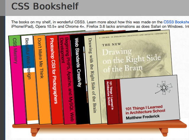
Update: I've re-jigged the CSS a little to account for some more perspective. I've also changed the shelf as the old one was, well, hideous. New screenshot below:


