Easy Semantic Forms with CSS
Posted on by Steve Workman About 3 min reading time
In the early days of the Internet, web sites were for gathering and displaying information. In its 20 year history, this hasn't changed much! At some point on a site you have to enter your details or what information you're searching for. So, it makes sense that the thing I spend most of my time doing is creating forms!
Most of the time you see a form, the label is on the left and the field is on the right, with validation or help after the input field. There are lots of ways this can be laid out, but the simplest and most semantically correct method is hardly ever used. What I'm going to show you is how to lay out a form properly with standards-compliant CSS.
The HTML The most semantically-correct HTML takes the following structure
<fieldset>
	<legend>Form Title</legend>
	<form action="#" method="post">
		<ol>
 			<li>
				<label for="field1">Field 1</label>
				<input name="field1" type="text" />
			</li>
			<li>
				<label for="field2">Field 2</label>
				<input name="field2" type="text" />
			</li>
 			<li>
			 	<input type="submit" name="submit" class="submit" />
			</li>
		</ol>
	</form>
</fieldset>
The form is contained in a fieldset element, which, naturally, is a set of fields. This has a legend element, telling the user what this area of the form relates to. This is especially useful for giving context to the fields in multi-part forms. Inside this is the form element, after which we have the ordered list. It makes the most sense for this element to be used as a form is a list of questions and completing a form is an ordered process, starting from the first field and then submitting. The
tag is one of the lesser utilised elements and most of the time, it won't interfere with any other CSS on your site. Inside each list item, we have a label and the input field. The label and its 'for' attribute is very important as screen readers use these to identify what field a user is currently focused on. The 'for' attribute relates directly to the 'name' attribute of the input element, so make sure that these are the same.
The CSS This is the tricky part, though it really shouldn't be! Working on the principal that each list element takes up the whole width of the fieldset, it's pretty simple to use them as floated block elements, as the code below shows:
legend {
	margin-left:1em;
	color:#000;
	font-weight:bold;
}
fieldset ol {
	padding: 1em 1em 0 1em;
	list-style:none;
}
fieldset ol li {
	float:left;
	clear:left;
	width:100%;
	padding-bottom:0.5em;
}
label {
	float: left;
	width: 10em;
	margin-right:1em;
}
fieldset.submit {
	float: none;
	width: auto;
	border-style: none;
	padding-left: 12em;
	background-color: transparent;
	background-image: none;
}
Starting at the top, the legend indents the text and sets it colour and weight. The ordered list then gets some padding and has its list style removed. This gets rid of any 1, 2, 3... notation that the browser adds. The magic then starts in the list items. Firstly, they are floated to the left to allow for multiple elements on the same line. It then clears the float from any previous elements (i.e. the4. above) and sets its width to 100%. This gives it complete ownership of the whole width of the fieldset - any subsequent list items will be on the next line down. Some padding is applied to the bottom of the list item to separate the fields making it easier on the eye. The labels are then floated left within the list item. They are given a width of 10em and a right-margin of 1em. This gives enough room for most long labels and then all input elements to the right will be in line. The use of em is important here as users with non-standard font sizes will have consistent margins, whereas using % or px will produce an inconsistent look and feel. Finally, the submit button is given a class of submit to correctly align the element with the input elements. This could also be achieved using input[type="submit"] but IE6 doesn't support attribute selectors so a class is used. Notice that this CSS doesn't style the input element at all. All elements after the label are free to be styled as required, they'll all be in the correct alignment. This method works especially well with date pickers which have a small linked image at the end of the input element. The same goes for validaiton messages: no extra formatting is required.
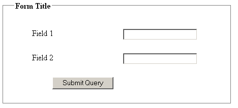
This solution produces the following elegant form: 
It doesn't look pretty, but a few colour changes can make this simple form zing.
So, there you have it. Really simple, elegant, semantic forms.