Best Practice Error Messages
Posted on by Steve Workman About 2 min reading time
 Entering data into a web site is possibly the most common task that is performed. In my time designing and developing sites, I’ve seen good forms and I’ve seen bad forms. The biggest sin with these forms has always been error messages. Web sites are designed to communicate a message. Whether it’s the day’s news or that a friend is having a party, the message must be clear an unmistakable. With errors, correct placement, styling and reference are essential. I’m going to show you how not to do it, and then best practice error messages.
How not to make error messages
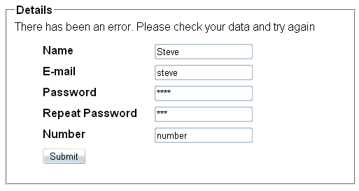
Quite simple this: by displaying no information at all, just telling them that there is an error, like this
The user has a hard enough time finding out that there’s something wrong, let alone working out what they have to do to correct it.
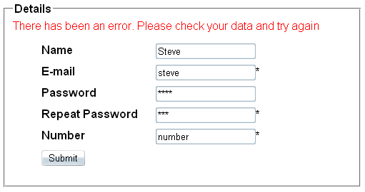
Pointing out that something is awry in a clear colour is better, though this still doesn’t really tell the user what is wrong. Be aware of colour blind users – 4 in 10 males in the UK are colour-blind, with red/green being the most common kind. Remember this when putting red text (the accepted colour of error/warning messages) on a green background as colour-blind users won’t see it.
A better way is to list what is going wrong at the top of the page. This gives the user information about what has gone wrong, though it still leaves the user to work it out for themselves (which is a bit mean, considering the web site knows exactly what went wrong). This effect can be achieved very easily in frameworks like ASP .NET as there are built-in controls to display this very data.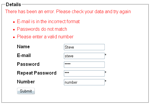
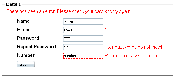
Error messages start becoming usable from this next point, taking the cognitive workload away from the user by placing error messages next to the field that has an error. These error messages should be descriptive, not just an asterisk and let the user work out what is wrong.
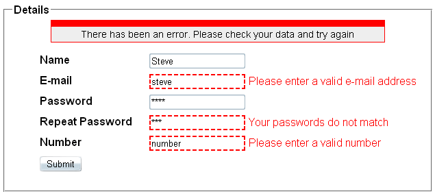
When this is combined with an error message at the top of the page to alert the user that there are problems, the form becomes usable. However, in its un-styled nature, these error messages can seem abrupt and abrasive to the user. This is the best-practice styling that has been applied by many companies, giving the right information to the user and how to fix it.
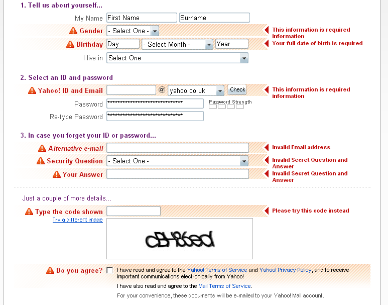
It's not all doom and gloom though. Many major sites provide excellent error messages. Yahoo shows best-in-class error messages, highlighting the individual rows, providing graphical and textual indicators of errors that are readable and descriptive
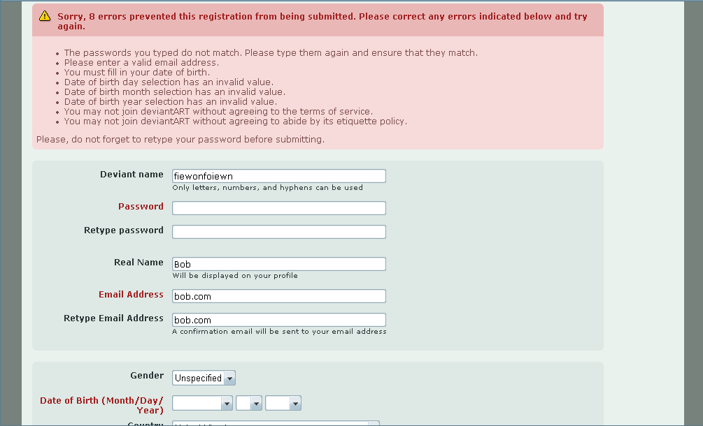
Artistic web site DeviantArt goes with the header description approach whilst changing the colour of the incorrect field labels. Whilst I'm not a fan of the latter as it is not descriptive, the header message is well styled and conveys the error message accurately
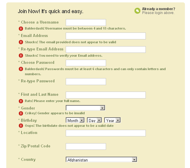
Finally, popular social bookmarking site Digg has a good registration page, though the error messages leave something to be desired. Whilst they are next to their respective fields, they do not stand out from the page
So, how can you achieve these effects simply and effectively with very little code. It's as simple as putting jQuery validation on your site. It's simple, unobtrustive and very customisable. Have a look at the jQuery validation demonstration site for all the wonderful things that it can do.
