Responsive web design in practice - making Steve and Emily's Wedding.co.uk
Posted on by Steve Workman About 3 min reading time
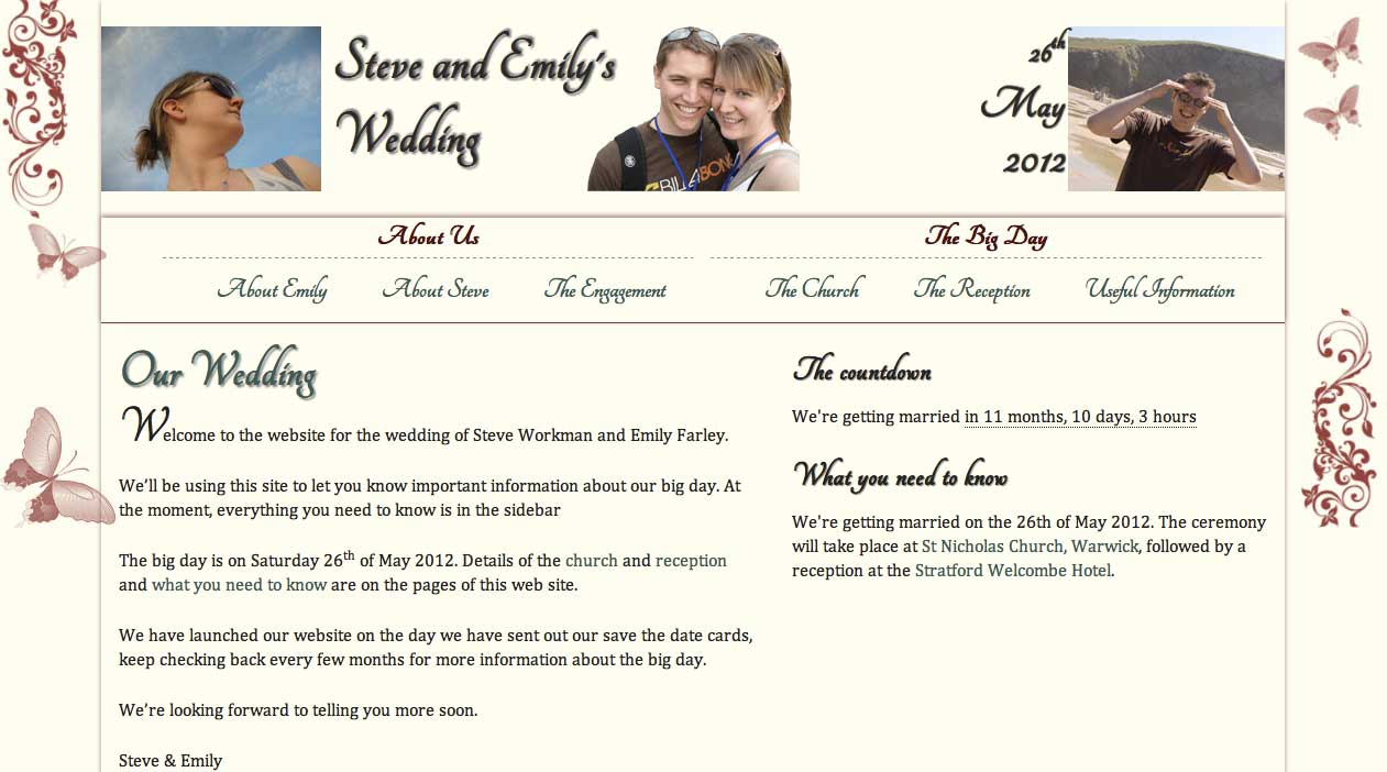
Over the last few months I've been making a web site for my wedding. Emily (my fiancée) and I didn't want your run-of-the-mill wedding website, hosted by someone on an unrecognisable domain (for example, ewedding.com or gettingmarried.co.uk sub-domains). I wanted something that I had control over, that I could make as the perfect website for us, not a nice template that thousands of others have. We wanted something personal.
Secondly, these pre-packaged themes aren't suited to modern web standards. They just-about work on small screens, and quite a few of them use flash, or they take 5-10 seconds to load (lots of people, heavily shared servers, you do the math). Don't get me started on the ones that play music in the background.
So I started with a solid foundation of responsive web design and HTML5. This is how I did it.
- Wordpress for the CMS
- 320 and up for layout
- Tangerine and Scriptina font
- Appcache to increase performance
Wordpress I used wordpress because it's easy to make great themes quickly. You've got full control of the output in a simple CMS. Job done, but for one thing: the default theme doesn't use HTML5 semantics. I took the Wordpress html5 boilerplate from Jeffrey Sambells and used that as my base, giving me a good template for responsive web design.
320 and up The choice of layout framework, 320 and up, comes from seeing Ethan Marcotte present at Future of Web Design, showing off the Boston.com re-design. I thought it was a wonderful talk and seeing how a site responds to screen size and context on such a high profile site made me rethink my views on responsive design. I used to think that for large, image-heavy sites, it just wasn't economical to make a site work with media queries. It's a change in mind-set to design for mobile first. Thinking like that, instead of retrofitting a smaller design onto your UI, makes the whole proposition a lot more appealing. Andy Clark took this concept and made a framework out of it, and that is 320 and up.
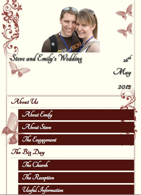
320 and up works on the principle that you code a mobile site, and layer additional layout on top with media queries for each of the sizes you want to support. Coding this way also makes you very aware that the content is very much the purpose of the site, and that nothing should be left out, no matter what screen size you're on.
Adding 320 and up to the HTML5 Wordpress baseline wasn't as easy as I'd have liked. No offence to Malarkey, but you don't need all of the 320 framework to make a great site, so I cut a number of the hacks out and updated the respond.js library. Still, it solves many of the gotchas for you, so use it :-)
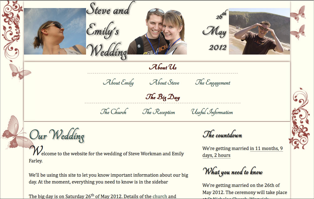
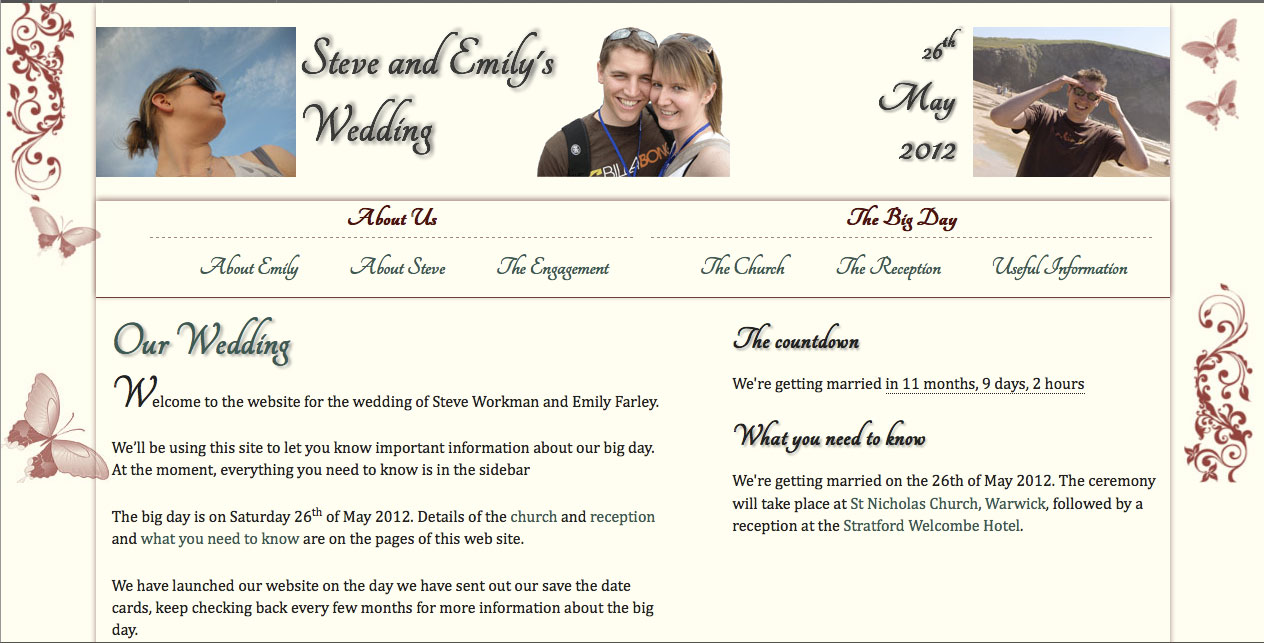
320 and up has these screen size stops built in: 480, 768, 992, 1182, and a high-dpi option for retina displays . For my this site, I added in 768 and orientation: portrait to deal with iPad portrait mode problems. It's up to you what stops you use, but these worked for me. If you want to support the galaxy tab and other screen sizes, more media queries are easy to add in.
The Design There's a lot of CSS3 that's gone into this site. The background and header uses CSS3 multiple backgrounds to allow the layout to flex without the overhead of another div to layer the extra backgrounds on. Note, I did chicken out and add those extra divs in as it just didn't look as good on IE7/8 and that's what 30% of people are using on my this site.
The font choice was very important for me and Emily, and FontSquirrel came to the rescue. It's got a great selection of script fonts that just aren't available in the standard set that comes with computers these days. Text shadow adds to the effects but isn't essential, so it doesn't look out of place on IE.
My use of box shadow is basically in place of borders. It makes the whole theme pop off the page with slight shadows and a red tint that matches the theme really well. However, box shadow on the iPhone and small screen devices slows down scrolling, and should be used sparingly. Lovingly, responsive web design lets me turn it off for small screens :-)
There's lots of other little things, like using CSS3 selectors so that class names don't have to be used all the time, and some nice stuff for the first letter, and also border radius (as standard).
Performance The site uses appcache to speed up the site loading, and it makes a massive difference. The cache is around 1MB, that's data I'll never have to download again. It works on all of the latest browsers and mobiles (where is makes the most difference). I can't recommend it enough.
For the useful information section, I used local storage to keep the different sections open/closed so that it's the same when you come to the page next time.
Summary In summary, this site has allowed me to showcase responsive design, mobile first, lots of CSS3 and make it work in IE7/8. Take a look at the source code, and learn. Oh, and wish us well on our wedding :-)
