Designing for Touch
Posted on by Steve Workman About 5 min reading time
Over half of the UK population has a mobile phone, and there are 40 million active mobile devices. Of that number, there are about 8 million touch screen devices, with around half of that number being accounted for by the Apple iPhone. More than half of the new handsets being manufactured today have touch screen functionality, though no other single device has had the success of the iPhone.
The reason is partly to do with the Apple brand, but this is second to the iPhone’s well-designed software, specifically the user interface (UI). Interacting with an iPhone is simply a joy and no other device has combined its simplicity and accessibility. How can its design principles be learned upon to produce great touch screen interfaces?
The secret lies in keeping to the four principles of touch screen applications: direct interaction, concise wording, natural input and integrated applications.
The iPhone is a direct interaction device, meaning that all of the input takes place on the screen, not relying on any other hardware keys to support the UI. It uses this direct input mechanism to allow the UI designer to place important navigation and action buttons within the UI in more intuitive places than hardware keys allow. This principle can be leveraged in one simple piece of advice: touch screen input is direct, place buttons in intuitive, easy to reach places for best usability. Because these devices are small, the edges of the screen are always in reach and easy to access, so it makes the ideal place for navigation and essential functions.
It is important to note the difference in the web and web interfaces with touch screen applications. A lot of web sites rely on a pointer hover in order to reveal different or additional navigation options. This is simply not possible with direct input devices as a finger never hovers on the screen, it simply taps. A small paradigm shift is expected from these designers to harness direct input correctly. This does not mean that a web interface cannot function as well on a touch screen device, far from it. The web has to be tailored for direct input. In principle, the web will work just fine on any display, but the screen is a lot smaller on handheld devices and information is either lost of compressed, making the user perform a large number of ‘zoom’ actions to locate the information that is contained within the web page. Making direct input usable can simply be a matter of reducing the zoom operations. Make action buttons big; big enough for a finder to press without having to zoom in. Apple recommends a 40 pixel or larger button to allow for all finger sizes.
All of these lessons on the mobile web show why Apple’s applications have taken off so well; they are simple and concise. None of the apps are overcrowded or even feature word-heavy instructions. This part is key: if a user does not know what to do with a button within the first few seconds then the wrong label has been chosen. It is not that the screen is complicated and needs explanation, if it does then you should think of alternative ways to express that function.
Take, for example, the iPod application. It plays music, but often there is a very long list of music to be displayed; it has to be categorised by artist, album or genre. If the app decided that it wanted to give categorisation choice to the user, it may start with a few buttons asking for a category selection (see diagram).
Instead, it offers the most recognisable selection and then keeps all of the other options available at all times by using a tab bar. This level of functional accessibility paves the way for a golden rule in touch screen menu navigation: all functions must be accessible within three actions. There are no functions in the iPod app that cannot be accessed in more than three screens of data. This is a very important rule for touch screen devices, as many follow the single hardware button principle of the iPhone, giving no permanent button for going back a level of detail (which, as before, is a good thing) then burying functions deep within the menu system, making it very difficult to go from one set of functions to another. Three is the ideal number here as it allows for a good level of data granularity and yet has all top-level functions on two taps away.
There are some exceptional applications, but no exceptions to the rule. If there are circumstances where actions require more then three touches, then those apps need to make use of natural input, an innovative facet of touch screen design. Natural input is performing an action with a motion or gesture which is indistinguishable in the given context. Put into plain English, there can be no other plausible action that can be represented by a given gesture. A perfect example of this is the Photos app on the iPhone. Select an album, where to start, then view the pictures (note: three steps). To view the next picture, push the current one off the screen. Zoom is performed with a pinch and you can rotate pictures by picking up its edges and turning it round. Photos also rotate pictures automatically based on the orientation of the device. There are few better examples of natural input that this.
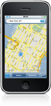
Applications can be further improved by using natural input. The iPhone’s Maps application, especially when compared to its web-based counterpart, is not the most intuitive application. Sure, it has a good amount of options, uses one finger to pan around the map and two to zoom, but when I want to do anything advanced it falls short. Say I want to know how far Leicester Square is from my office in Victoria. Both locations easily fit on one map, but I have to search for the locations before it drops a pin into the map. A more usable way would be to allow me to drop the pin from the UI, a double-tap would be natural, or dragging a pin from a menu bar and placing it on the map.
Maps can create a route between those two places for me. The route it’s given me takes me along The Mall, but I want to go through Green Park. Attempting to move the route with a drag action (like the web interface) I only succeed in moving the map. There are ways around this, but it is not as easy as it could be and certainly isn’t as natural. The same goes for wanting to move a pin; the functionality is either absent or difficult to use. Improvements here would be very simple and highly effective.
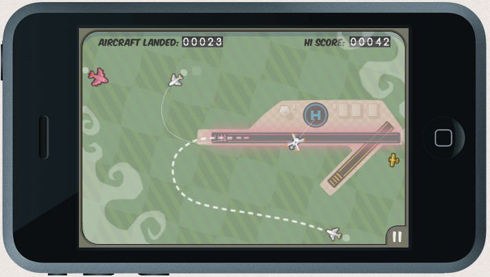
Natural input is very under-used by non-Apple applications, but good use of it can lead to very successful apps, like the excellent Flight Control, where plane flight paths are dragged with a single finger, or the intuitive first-person shooter controls on Wolfenstein 3D.
The final piece of Apple’s puzzle is integration. This has been a large component of all ‘Web 2.0’ applications, the ability to communicate between sites easily, as if you were using the site itself. It is not simply about providing links but providing functionality between applications. This integration is important on touch screen and handheld devices as removing all unnecessary actions and tasks is essential. If an application is able to perform useful tasks with a piece of information, it should not rely on the user to perform that task. For example, the iPhone app Zensify can post pictures to Twitter and Facebook, and does so at the same time without the user having to perform the action for each service.
Creating great touch screen applications can be hard, but sticking to the four design principles, direct interaction, concise wording, natural input and integrated applications, and you’ll be well on your way to making an award-winning app.


